Prime Campus – Website, Brand & Print
Tiny collaborative team, big dreams, and a polished look to match
Role: Graphic Design, Web Design
Prime Campus has been a regular, reliable client for well over a decade; I was introduced via a past full-time role, and we’ve been kicking goals together ever since.
The brand, the company, the achievements have all grown, but what’s amazing is that the core headcount hasn’t. It remains the same small network of professionals all doing their part, collaborating like a well-oiled machine with a shared vision.
For me, as a designer, this has been one of the greatest ongoing experiences of trust, communication and teamwork under pressure in my career. The key stakeholder is incredibly responsive and over the years, we’ve turned those comms into a fine art. These days, it’ll be “Annual report headed your way at the end of the week!” or “It’s time for the Q1 Report” and I know that all the material I need will be ready for me at the outset, and exactly what’s expected of me once it’s landed. We signpost points of friction, forecast risks to deadlines, difficult third parties, surprise additions, the works.
Branding
It all started with a simple request: can you make this brand look clean and professional?
Yup, sure can.
There’s two key audiences this brand appeals to: the students renting the accommodation, and investors/prospective investors. The company stands out among other real estate rental companies, in that they exclusively exist to provide clean, healthy, safe student accommodation and help young people adjust to fully-fledged adult life along the way. They show extra care for their tenants, and do so efficiently and quickly, so they can truly focus on their studies and not half freezing to death through the unforgiving Dunedin winter.
The brand itself needed to be tidy and serious, but showing some warmth without being patronising. It came to me half-formed with red and black as the key colours. The client had a fairly clear image in his head of a pentagon that looked like a house but not quite, and we went through quite a few iterations of “housiness” before settling on something far simpler and cleaner.
I chose a humanist font to offset the (now tweaked and softened) red and black colour palette; Lato fulfilled ‘warm’ and ‘clean’ without being unprofessional. Yes, I know, I know; but back in 2016, the font was yet to achieve the height of its popularity!
As you’d expect of any competent logo, there’s a lot of secret alignments throughout both compositions – the full stack version, intended for large reproduction, and the horizontal version, intended to squeeze into tight spaces. I wanted it to reflect the sturdy precision that the company dedicates itself to, while remaining warm and reliable for the student tenants.
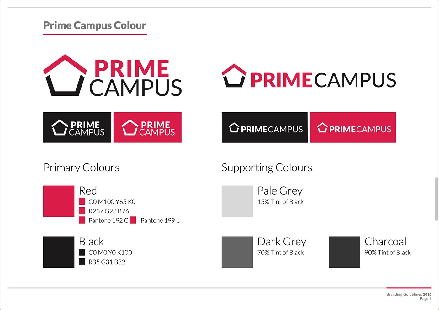
It’s been Prime Campus’ brand ever since, and I’m always stoked to see it pop up in the wild.
Website
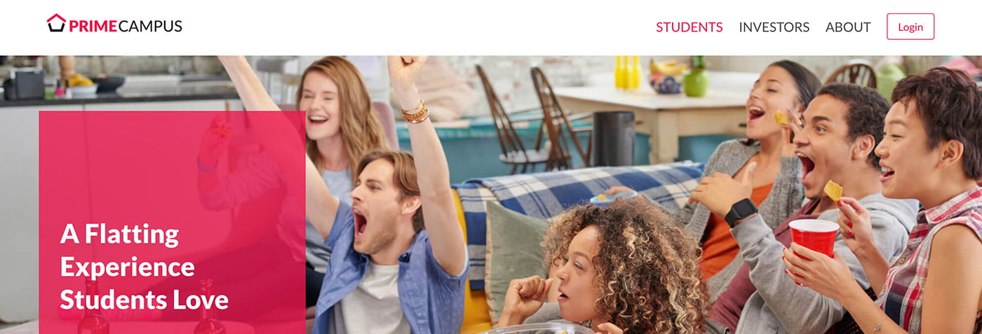
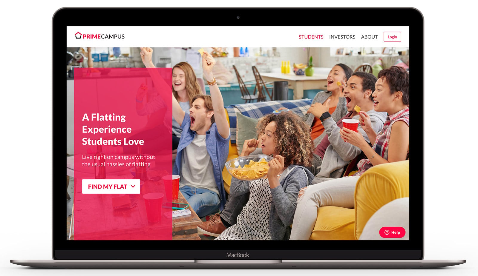
The new Prime Campus website was a surprise collaboration. As is the way this tight-knit team operates, the software lead had quickly pumped something out to fill the gap and get some serious performance gains. It’s built in React, heavily utilises the Bulma CSS framework, and loads like an absolute demon – but as is normal in the software world, the overall design needed a designer’s crayons thrown at it before it was ready to be presented to prospective investors. On short notice, of course.
The challenge: crank out this sucker live in the browser, using React for the first time, and make a PR that doesn’t drive the software engineer nuts.
During the first draft he requested I use Bulma as much as possible, fearing there would be designer potato CSS left throughout the project if left to my own devices. Thankfully, after that first PR, I was given the thumbs-up to go to town!
The end result: improved polish with the website being back on brand and reflecting the print material a little more, on a tight turnaround, and still ridiculously fast.
Print and Digital Documents
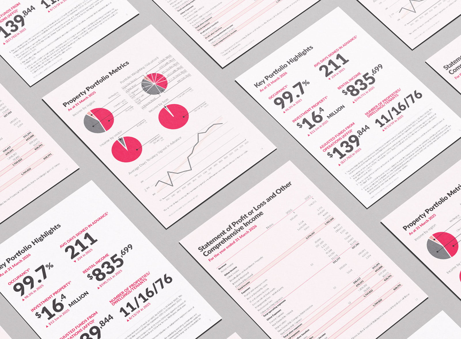
This client doesn’t print many of their documents, with communication and operations being almost entirely digital and remote. The two major documents that come out each year, though, area always designed to print standards but with interactivity preserved.
The Annual Report and Information Memorandum are usually around 37 and 77 pages respectively, with intensely detailed tables and data throughout. This is the sort of work that has formed the bread and butter of my career over the years: “head down, arse up” and grind through huge, detailed documents. The supplied documents usually come through from multiple sources, often in piecemeal no matter how hard the client tries to wrangle the cats, and to streamline the process, we’ve developed our own internal proofing and editing system in Google Docs.
Something I’m rather proud of is being able to digest an onslaught of material and bring it together into a cohesive document that’s straightforward for clients to proof and mark up. The Prime Campus whoppers have absolutely refined this process in recent years!